Interactive Infographic
Myths & Magic: Symbolism in Thai Temples
Information design | Interactive design | Illustration | Visual communication | User experience research

Myths & Magic: Symbolism in Thai Temples is an infographic for people interested in Thailand’s temples and the symbolism found there.
This infographic provides:
An introduction to common deities at the temples
A brief history of where these deities came from
A short etiquette guide for those visiting Thai temples
The design incorporates interactive elements (cards, icons, illustrations, and graphs) to enhance the user’s discovery and learning. The design also utilises muted background colours and striking illustrations to help navigate the user through the information and various sections.
I initial designs were tested among a small group of users; Data gathered from this usability research helped me to reiterate my design and produce a more user-friendly final product.
Research & Low Fidelity Prototyping
To develop the content of Myths & Magic, I researched the following areas:
Symbolism in Thai temples and Thai Buddhism
Temple architecture and history
Importance of temples and belief systems in Thailand today
I then constructed several stories based on my findings.
I sketched out four concepts incorporating different story-telling approaches. I considered historical narrative, linear narrative, and quest narratives. I also considered different visual methods I could use to demonstrate statistics, concepts, geography, and timelines.
Mid Fidelity Prototyping & USability Testing
I narrowed my concepts down to two versions. I created these two concepts as mid fidelity prototypes in Figma (wireframes with minor clickable elements). Both concepts had the same content; However, I reversed the sequencing of information in the second concept.
I conducted usability research (semi-structured interviews) among a small group. The purpose was to:
A/B test the preferred sequencing / story-telling among users
Observe how users understood and used the interactions
Test how well users digested and comprehended the information overall
After analysing the data (affinity mapping), I distilled my insights into the following:
Participants expressed that while they don’t mind large amounts of information, they do mind how much control they have over accessing, consuming, and comprehending it.
Data, text, or visual design that had been oversimplified as a way to enhance participants’ comprehension could actually contribute to their misunderstanding, misinterpretation, and general confusion.
Most participants preferred a sequence that started with the symbolism and ended on ‘temple etiquette’ and how the two are related. Participants felt this story lead to a relevant and actionable message.
High Fidelity Prototype
Based on the insights gathered, the following design principles were created to guide my design iterations:
User-Controlled Consumption: The design should allow users to ‘opt-in’ to see more information. This allows them to comprehend data at their own pace, minimising information fatigue.
Clarity Over Simplicity: Users like complex information when they can understand it fully and easily. Clarity, or ease of understanding, is more important than over-simplification.
Re-Centre the Audience: The design should come back to the audience and give them a strong final message.
With these principles in mind, I iterated my design towards the final, high fidelity version (fully interactive). Some of the design changes I made were:
I used the sequencing from Concept 2 as it was more engaging for users
I removed the population and temple data components as users felt it did not contribute to the overall story
I refined my colour palette towards a muted / pastel background + striking foreground and illustrations to highlight specific elements
I introduced section dividers to signify to users their progress and movement through the story
I created elements that helped to ‘stagger’ information and allow user-controlled consumption
I revised my timeline to put a greater focus on ‘chunks’ of history and large cultural movements that influenced Thai mythology
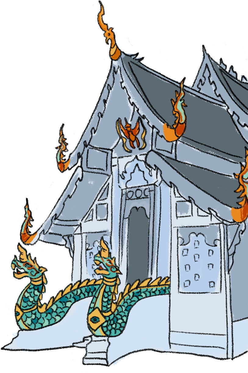
All illustrations were drawn by myself using Adobe Photoshop. In my atomic design system, I created a UI stack for each element to simulate a more natural interactive experience. To ensure my design was accessible, I chose colour pairs that met contrast ratio guidelines of 4:5:1 (WCAG 3.0); I also checked that my revised colour palette would be suitable for users with varying levels of colour blindness.
You can view and interact with the Myths & Magic: Symbolism in Thai Temples high fidelity prototype at this link. You can also see it in action in the video.
“Myths & magic are woven into all parts of Thai temples. Noticing, understanding, and respecting them is a great first step to appreciating the culture, history, and people of Thailand.”