Remote Workers’ App
User research | Usability research | User interface design
I designed Ceres, a mobile app to help remote workers (RWs) find cafes to work from. The design offers several solutions for RWs trying to:
Find and locate cafes
Quickly assess cafe environments, including amenities like wi-fi, power outlets, and quiet spaces
Verify the cafe’s suitability amongst the RW community
Receive communication from cafes (i.e. etiquette guidelines)
This app’s design empowers remote workers to discover and choose the best places to work outside of their homes.
User Research
I undertook primary and secondary user research to explore the attitudes, beliefs, and behaviours of RWs participating in “cafe work culture".
Through secondary research (desk research), I gathered statistics and evidence to support:
The growing phenomenon of “cafe work culture” across Australian and New Zealand RWs since 2020
The appeal or preference of working from cafes for young Australians, including 10% of Australian Gen Z workers
I then undertook primary research (observations and semi-structured interviews) with a small group of participants. After analysing the data (affinity mapping), I distilled my insights into the following:
Participants have a range of reasons for working from cafes that reflect their individual priorities and stage of life. However, there is an expectation for all cafes to be a space of comfort, refuge, and relief.
Remote workers have specific preferences around their physical and social experiences at cafes because, in addition to wanting to be productive, they want to enjoy being productive.
When remote workers sense a social misalignment (the feeling of "taking up space") with a cafe and its other customers, they associate this with being alienated or unwelcomed.
Solution Planning
Guided by my user research findings, I reframed my design thinking towards the following questions:
How can my design help RWs find suitable cafes that meet their needs and their expectations of an enjoyable cafe work culture?
How can my design communicate cafe social etiquette to RWs without making them feel unwelcomed or unsupported?
Additionally, I made note of key principles that my design should strike for. These principles were a common thread in discussions of the ideal user experience raised by my participants. I summarised them as:
Accessibility: The design should enhance feelings of accessibility to amenities on offer
A Sense of Belonging: The design should encourage a sense of belonging by enhancing feelings of community, shared behaviours, and a general sense of being welcomed
Aesthetics: Creativity & Productivity: The design should incorporate creative and productive work culture elements and feelings (e.g. colours, space, sound, etc)
Low Fidelity Prototyping
I generated several app-based ideas for the potential design solution. Ideas were assessed against the above planning criteria, as well as the DFV model (desirability, feasibility, viability).
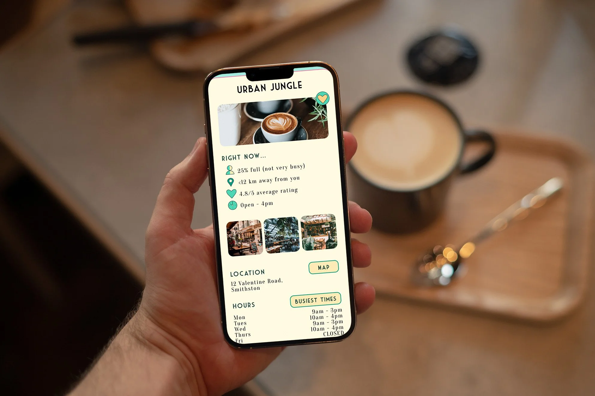
Eventually, I produced a low fidelity prototype of an app aimed at connecting RWs with suitable cafes; Its features included:
A cafe directory / search feature
Information around cafe etiquette
A live view of cafe capacity and seating
An amenities ordering system (e.g. high-speed wifi)
Notification / prompts around cafe capacity and etiquette
Mid Fidelity Prototyping & Usability TEsting
Once my low fidelity plan was finalised, I design a mid-fidelity prototype (wireframes and user flow) in Figma. Here, I created a design system and trialled the following:
“Cafe Consortium” as the app’s name
Typography (including placement and hierarchy)
Icons, buttons, and inputs (placement, style, and interactivity)
Colour palette (a pastel green theme to maintain a mix of corporate yet relaxed)
Feature placeholders
I conducted a second round of user testing among a small group to verify if my proposed design met their needs, desires, and expectations. The findings I gathered from this additional round of research allowed me to iterate my design further developing my high fidelity prototype.
High Fidelity Prototype
For my high fidelity prototype (clickable wireframes), I incorporated the following changes into my design based on the mid fidelity prototype user research:
I removed the Sign In screen as a prerequisite to accessing the app; Users expressed that if they were needing to find a suitable cafe quickly, this would deter them from using the app.
I redesigned and reiterated features such as the live cafe seat view, ordering menu, and notifications.
I redesigned all icons and buttons to be more legible and recognisable.
I revised the app’s aesthetic towards a more cohesive and distinct brand; The app was renamed to “Ceres”, the colour palette was enhanced with stronger values and contrast, and interactive elements were highlighted better.
In my design system, I created a UI stack for each element to simulate a more natural interactive experience while using the prototype. To ensure my design was accessible, I chose colour pairs that met contrast ratio guidelines of 4:5:1; I also checked that my revised colour palette would be suitable for users with varying levels of colour blindness.
You can view and interact with Ceres’ high fidelity prototype at this link. Additionally, feel free to watch the video of it in action either on this page or at this link.

“The recent growth in remote workers raises an opportunity to explore cafe work culture as it evolves to accommodate a multiplicity of customer experiences and needs.”